A usability-driven redesign of the RBC Mobile app’s Running Balance feature to improve clarity, readability, and user confidence.
This project is a university case study completed as part of my academic work. It is an independent redesign exercise and is not affiliated with or commissioned by RBC.
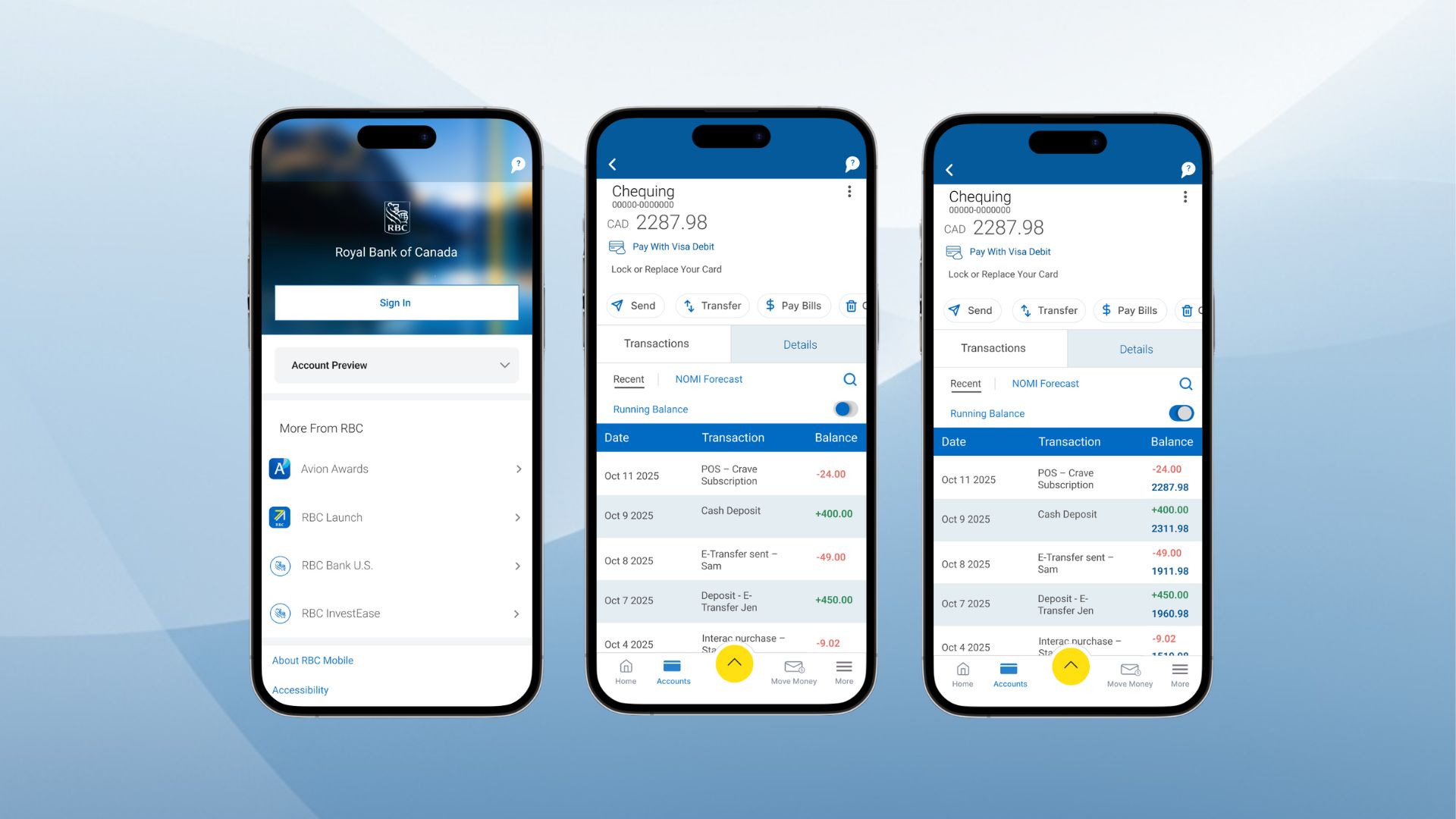
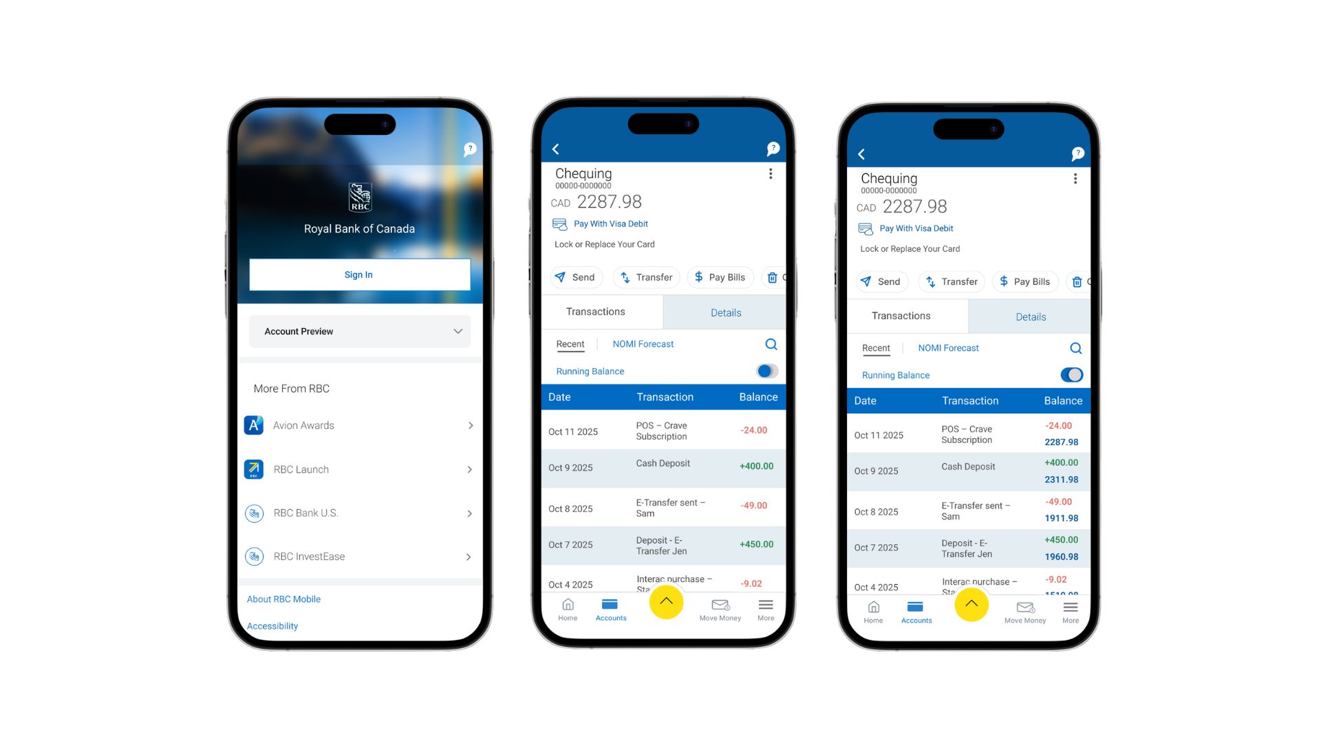
RBC Mobile is one of Canada’s most widely used banking apps, and the Transactions page is where users review purchases, transfers, and balance changes. In the original design, users see only a single “Available Balance” at the top of the screen without a running balance after each transaction. This forces users to do mental math and creates unnecessary confusion, especially when checking recent activity.
This case study walks through my full design process from identifying usability issues through heuristic evaluation to ideation, prototyping, and testing and ends with a redesigned experience that makes financial tracking more transparent and intuitive.
My Role: UX/UI Product Designer (Academic Case Study).
Tools: Figma, Figjam, Notion, Google Workspace.
Deliverables: Heuristic Evaluation, Design Analysis, Low-Fidelity Wireframes, High-Fidelity Prototype, Usability Test Plan & Report.
Users rely on the Transactions page to understand how their balance changes after everyday activities such as purchases, transfers, and bill payments. However, the original design presents only one static balance at the top of the screen, offering no visibility into how individual transactions impact the account. Without a clear record of balance changes, users struggle to verify their spending, confirm bank activity, and trust the information shown. This lack of transparency increases cognitive effort and makes financial tracking unnecessarily difficult.
For this case study, I focused on everyday mobile banking users between the ages of 18 and 60. These users interact with banking apps at least once a week to check balances, review recent transactions, send e-transfers, or pay bills. They expect clear, reliable, and easy to understand financial information, especially when reviewing their account activity.Most of these users rely on the Transactions page to confirm that purchases went through, verify transfers and bill payments, and understand how their balance changes over time. Any lack of transparency in this flow increases cognitive effort and directly impacts their confidence in managing their finances.
No visibility into balance changes
Users cannot see how each transaction affects their balance, which leads to uncertainty about their current financial state.
High cognitive effort
Without a running balance, users must perform mental calculations to understand how their money changes over time.
Difficulty verifying account activity
Users cannot easily confirm whether a payment, transfer, or bill was processed correctly.
Misalignment with real-world expectations
Traditional bank statements always show running balances, but the app does not, breaking users’ mental model of how financial information is typically presented.
Higher risk of errors
Misinterpreted balance changes can lead to overdrafts, declined payments, or repeated checking of transactions.
heuristic evaluation of the original Transactions page revealed several usability issues that directly impacted clarity and user confidence. The most significant findings include:
Visibility of system status
The app does not show how each transaction affects the balance. Users only see a final balance at the top, with no feedback on balance changes.
Recognition over recall
Users must remember their previous balance and mentally calculate the differences, increasing cognitive effort and the likelihood of mistakes.
Error prevention
Without a running balance, users can easily misinterpret their financial activity, which can lead to overdrafts or repeated checking.
Match between system and real world
Traditional bank statements always show running balances. The app’s omission breaks users’ mental models of how financial information is typically presented.
Flexibility and efficiency of use
Users are not given the option to toggle between a simple or detailed view, limiting their control over the information they see.
These heuristic findings helped confirm that transparency and balance visibility were the core usability issues to address.
Gabriel, 29
Everyday Spender
About
Gabriel is a young professional who uses mobile banking several times a week to keep track of his spending. He regularly checks his balance after small purchases, online orders, or e-transfers and wants immediate reassurance that everything processed correctly. He values clarity and expects his banking app to present financial information in a simple and transparent way.
Goals
• Understand how each purchase affects his balance
• Confirm that transactions are processed accurately
• Quickly identify unexpected charges
• Feel confident in his day-to-day spending
Frustrations
• Needs to mentally calculate his updated balance
• Cannot easily verify balance updates after payments or transfers
• Feels uncertain when the app does not show clear transaction impact
• Spends extra time double-checking transactions
Behaviours
• Checks balance multiple times a day
• Reviews transaction details when something seems off
• Relies on mobile banking for financial decisions
• Prefers clear, straightforward information
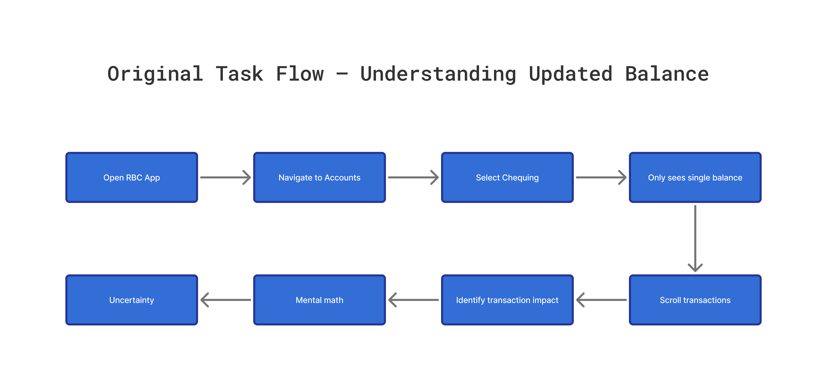
This task flow illustrates how users currently try to understand how their balance changes after a transaction in the original RBC Mobile design. The process requires multiple steps and forces users to rely on mental calculations, which creates uncertainty and reduces clarity.
Steps in the original task flow :
1. Open RBC Mobile App
2. Navigate to Accounts
3. Select Chequing Account
4. Only sees one “Available Balance”
5. Scroll through transaction list
6. Try to identify which transaction affected the balance
7. Do mental math to calculate the new balance
8. Feels uncertain and re-checks for reassurance
Across user research, heuristic evaluation, and analysis of the original task flow, a clear pattern emerged: users rely heavily on the Transactions page for day-to-day financial clarity, yet the design does not support that need. The absence of a running balance forces users to calculate updates manually, creates uncertainty when reviewing recent activity, and breaks alignment with familiar financial models such as bank statements. These insights indicated a strong opportunity to introduce more transparency, reduce cognitive load, and help users quickly understand how every transaction affects their balance.
Users need a clearer way to understand how their account balance changes after each transaction. The original design forces them to do mental calculations, re-check entries for reassurance, and interpret incomplete financial information. To address these challenges, the redesign should make balance updates more transparent, reduce cognitive load, and help users instantly understand how every transaction affects their available funds.
Users struggle to understand how each transaction affects their available balance because the original RBC Mobile design only shows a single balance at the top of the page. This forces users to mentally calculate updates, re-check entries for reassurance, and interpret incomplete information. The redesign should reduce cognitive load, improve clarity, and help users instantly see how every transaction impacts their money.
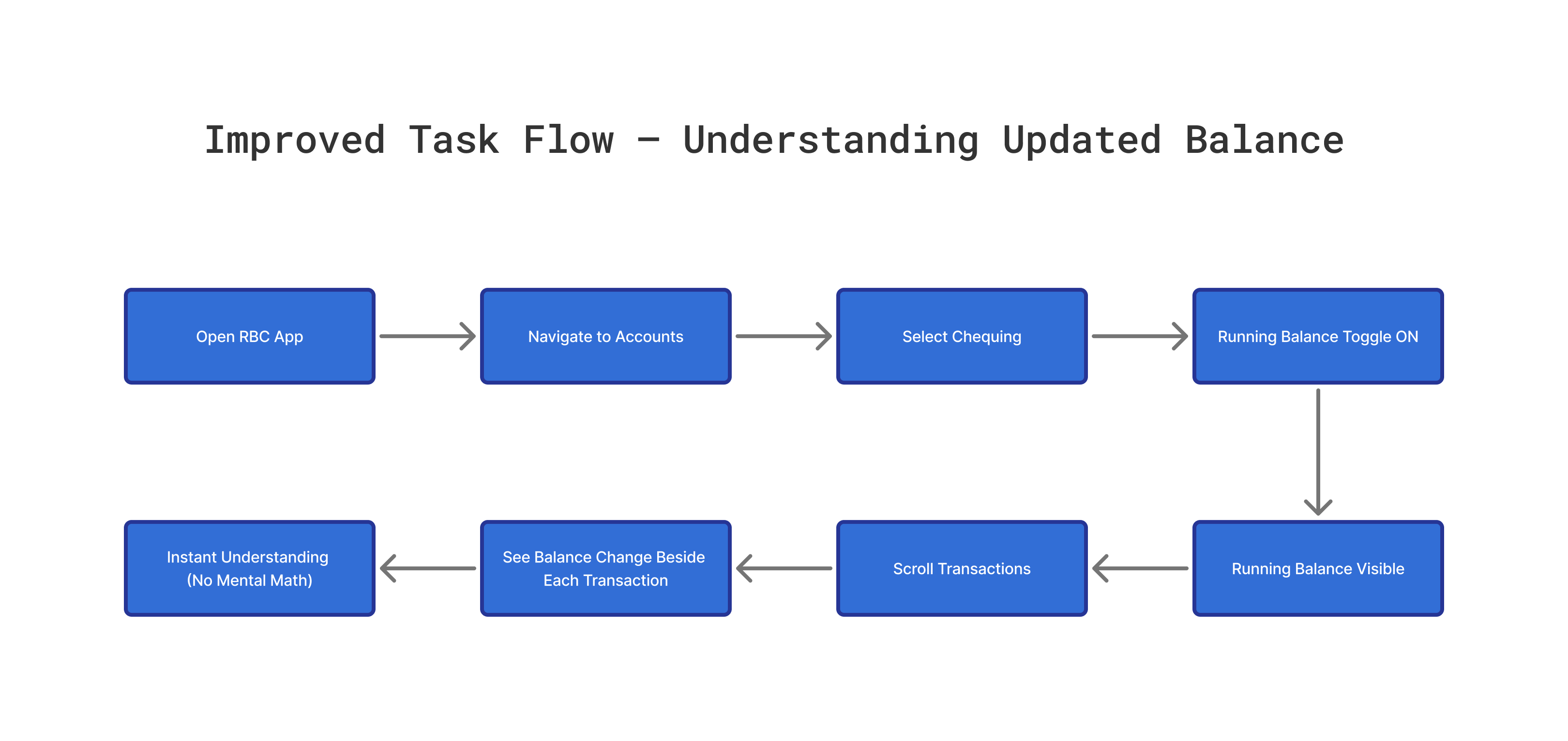
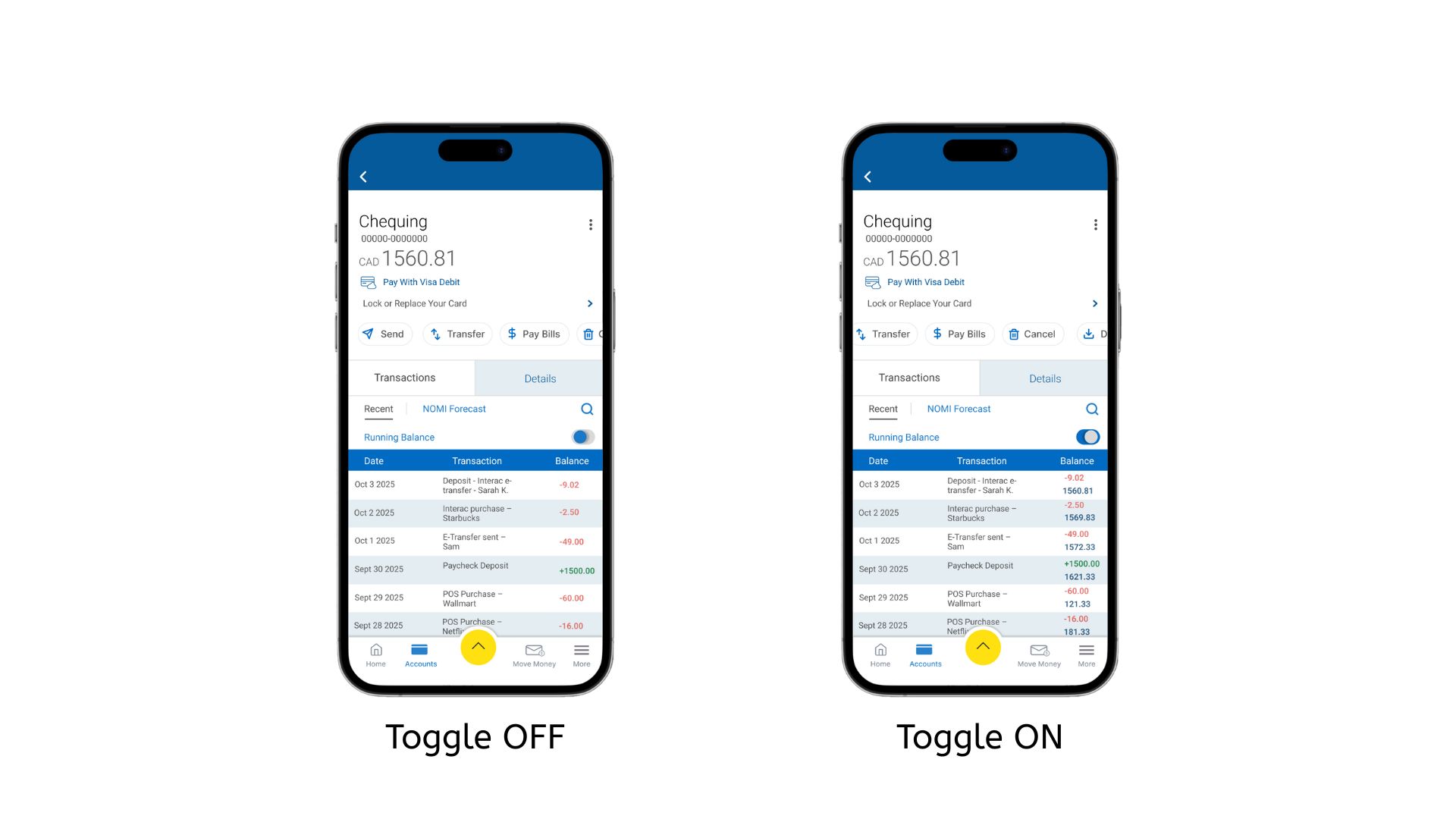
The updated task flow removes unnecessary mental effort by introducing a running balance directly inside the transaction list. Users no longer have to calculate updated balances manually, and the optional toggle ensures the interface remains flexible for those who prefer a more minimal layout.
Improved Steps :
1. Open RBC Mobile App
2. Navigate to Accounts
3. Select Chequing Account
4. Toggle running balance ON
5. Running balance becomes visible
6. Scroll through transactions
7. See balance change beside each entry
8. Instantly understand how each transaction affects available funds
.png)
• The scrollable transaction list only used half of the screen height, reducing visibility.
• Typography for transaction details was too small, making the content difficult to scan.
• Typography for transaction details was too small, making the content difficult to scan.
• Users needed to scroll more than necessary to view transactions.
• The running balance area felt cramped within the narrow layout.
These issues highlighted the need for improved spacing, larger text, and a more open layout for better readability and usability.
• Increased the height of the transaction list so more items are visible without extra scrolling.
• Enlarged typography for better readability across all transaction details.
• Improved spacing and hierarchy, making balances easier to scan.
• Coloured withdrawals in red and deposits in green to help users quickly differentiate transaction types.
• Styled the final daily running balance in dark blue to emphasize clarity and separation from transaction rows.
• Cleaned alignment and spacing for a more polished and intuitive layout.
• Maintained RBC’s minimal, clean visual style to ensure consistency with the existing app and avoid unnecessary aesthetic changes.
I conducted a moderated usability test to evaluate whether the redesigned Running Balance feature improved clarity, readability, and ease of use. Participants completed realistic banking tasks on a mobile Figma prototype that reflected the updated transaction view and the new Running Balance toggle.
The study followed a formative, moderated testing method. I facilitated each session, asked participants to think aloud, and observed how they interacted with the prototype. Sessions were run in a quiet space over Zoom using a smartphone. Participants were general mobile-banking users who regularly check their accounts. Each test lasted around 15–20 minutes and followed a consistent script and task list.
• Navigate from the home screen to the Chequing account.
• Turn the Running Balance toggle on.
• Scroll through transactions and observe how the balance changes.
• Turn the toggle off and compare both views.
• Identify the running balance after a specific transaction.
• Users easily found the Running Balance toggle after a brief exploration.
• The taller transaction list and larger typography improved readability.
• The color coding (red withdrawals, green deposits, dark-blue running balance) helped users quickly interpret financial changes.
• Participants liked having the option to switch between simple and detailed views.
• The V2 design was consistently preferred because it felt clearer, easier to read, and more intuitive.
• Overall, V2 felt clearer, more logical, and more similar to real banking app behavior.
• Increased spacing under section headers.
• Enhanced contrast for running balance numbers.
• Added slightly more padding in transaction rows.
• Improved alignment for a cleaner, more consistent RBC-style layout.
This project focused on improving the clarity and usability of the Running Balance feature while maintaining RBC’s clean, minimal design language. Through low-fidelity explorations, high-fidelity iterations, and usability testing, I delivered a clearer and more confident experience for users who want to understand how each transaction affects their balance. The final design reduces cognitive load, improves readability, and keeps the interaction consistent with RBC’s existing app structure.